Cross-posted from https://zindi.africa/discussions/14258
Introduction
The Microsoft Rice Disease Classification Challenge introduced a dataset comprising RGB and RGNiR (RG-Near-infra-Red) images. This second image type increased the difficulty of the challenge such that all of the winning models worked with RGB only. In this challenge we applied a res2next50 encoder that was first pre-trained with self-supervised learning through the SwAV algorithm, to represent each RGB and their corresponding RGNIR images with the same weights. The encoder was then fine-tuned and self-distilled to classify the images which produced a public test set score of 0.228678639, and a private score of 0.183386940. K-fold cross-validation was not used for this challenge result. To better understand the impact of self-supervised pre-training on the problem of classifying each image type, we apply t-distributed Stochastic Neighbour Embedding (t-SNE) on the logits (predictions before applying softmax). We show how this method graphically provides some of the value of a confusion matrix, by locating some incorrect predictions. We then render the visualisation by overlaying the raw images in each data point, and note that to this model, the RGNIR images do not appear to be inherently more difficult to categorise. We make no comparisons through sweeps, RGB-only models or RGNIR-only models. This is left to future work.
Goal of this Report
This report tries to explain a simple-to-understand method for visualising the distribution of raw predictions from a vision classifier on a random sample of data in the validation set.
We do this to, at a glance;
explain the model in ways that can help us improve it.
to understand the data itself, asking the question, if the model struggled to classify RGNIR images more than RGB images.
Data
Combining data from multiple sensors seems to be a good way to increase the number of training set examples, which has a known positive effect on train/test performance, among other measures of generalisation. Additional sensors are often deployed to capture different features from the baseline sensors, which may help to resolve their deficiencies. Less well studied is the question of when the additional sensor(s) add noise or require more representational capacity from the model, whether this reduces its capacity to perform the task on even the baseline sensor data.
Methods & Analysis
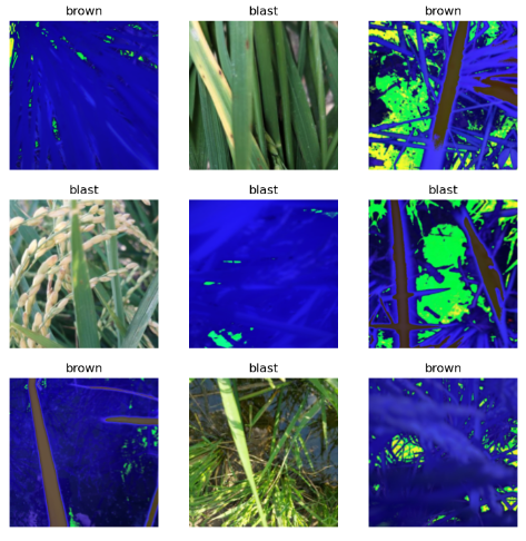
This work is an example of post-hoc interpretability, which addresses the black-box nature of our models, where we do not have access to their internal representations, or ignore the structure of the model whose behaviour we are trying to explain. This means that we only use raw predictions and labels (0.0 = blast, 1.0 = brown, 2.0 = healthy) on each data point, ignoring the model’s layer structure, learned features, dimensionality, weights and biases. This lets us use general methods for clustering data such as t-SNE. To plot a 2D image, we initialise using PCA to reduce dimensionality to 2 components, and apply perplexity=50. Note the overlaps i.e the presence of false-positives in each class, indicating the need for k-fold cross-validation.
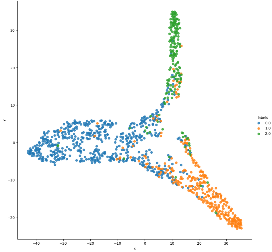
To show the effect that the image type had on classification, we overlay each datapoint with the raw image it represents. This follows from related work by Karpathy and Iwana et. al which use this methodology to produce informative visualisations with some explanatory value, although in this case the effect is more salient due to the two image types. We see where the RGNIR images tend to cluster in relation to their location in the global cluster regions in the chart above. Note the density of RGNIR images in the “tip” of the “blast” cluster (blue region in the first plot, scroll up then back), and in the bottom middle, indicating that while some RGNIR images were easy to correctly classify as “blast”, others were more easily confused with “brown” than they were with “healthy”. Qualitatively, there appear to be more false-positive RGNIR images than not, which might indicate higher uncertainty or noise in the predictions due to conflicting sensor data. This might be an artefact of the data augmentation methods used to train SwAV and the classifier. A lot more region-overlapping in the centroid of the image, together with the presence of both image types indicates some confusion for the classification task.
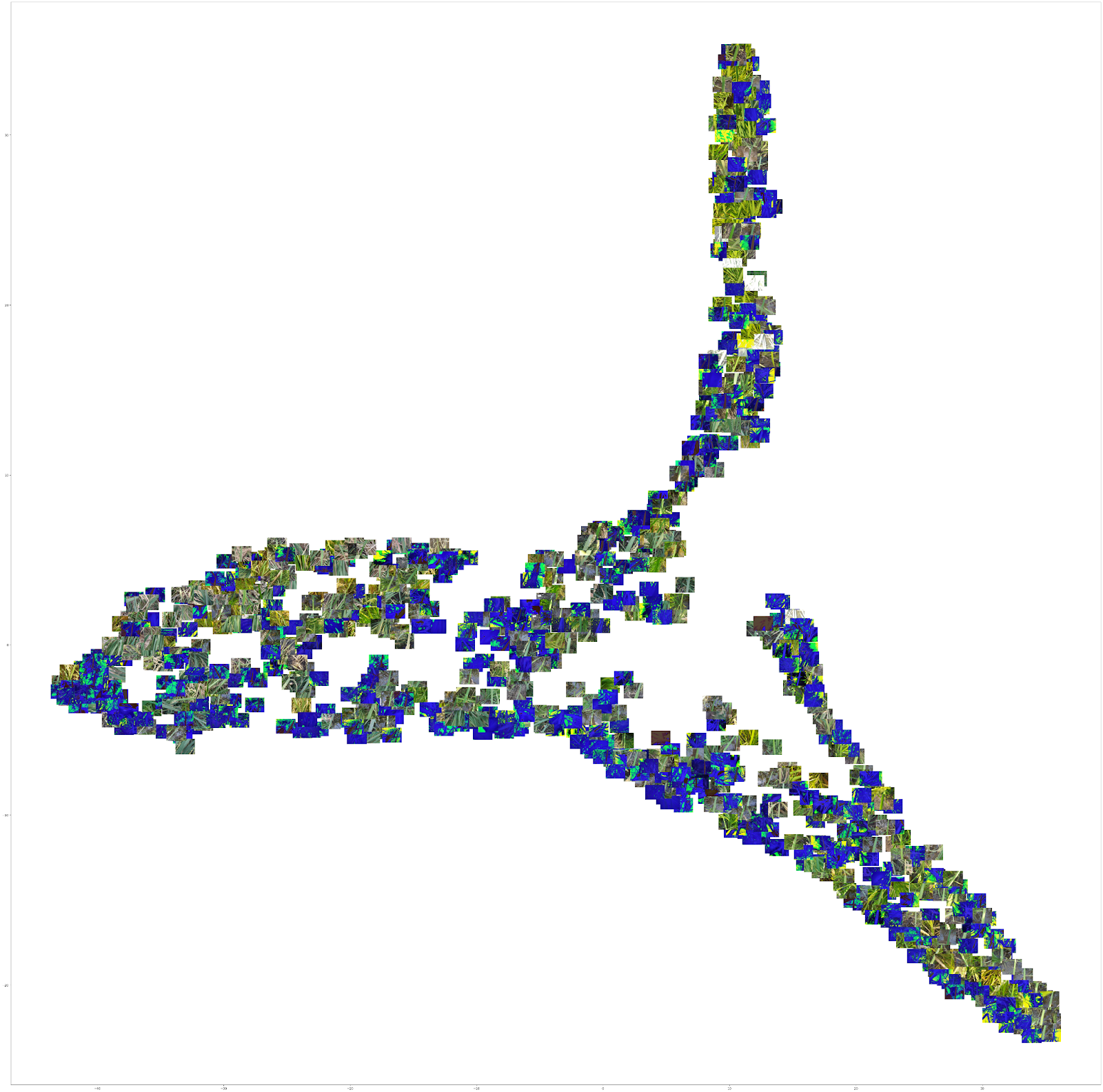
There are many reasons not to put much weight on the analysis above. T-SNE is valuable only after multiple runs have been observed. We might also want to include comparisons with weights from different epochs, early in training. More generally, statistical grounding improves the quality of good interpretability methods. In conclusion, the separation could be improved by applying readily available methods and there is no a priori reason to expect the pretraining strategy to contribute to better separation of classes. It helps with representing the images more fairly, but not decisively for the classification problem. All this work can be reproduced with the notebooks available here. The repository also has links to model weights: Rice Disease Classification through Self-Supervised Pre-training.
Conclusion
We show that when correctly applied, t-SNE, or potentially other types of dimensionality reduction methods can produce plots that can help us understand which of our training strategies could be changed in order to improve the model’s test set scores. In this case, we identify cross-validation as a potential intervention. We also learn more about our data using a method that is reproducible and reusable for other domains.
Acknowledgments
Kerem Turgutlu for self-supervised: https://keremturgutlu.github.io/self_supervised
Zachary Mueller: https://walkwithfastai.com
Jeremy Howard: https://fast.ai
Daniel Gitu, Ben Mainye and Alfred Ongere for helping proofread a draft of this document.
Open Philanthropy for funding part of this work.
Appendix
1: Self-Distillation
When training a classifier, we eventually find predictions that are correct with high confidence. Naively applied, self-distillation in this case meant assigning labels to high-confidence test set examples. We collect these new labels and create a new “train.csv” which is used to fine-tune the best checkpoint with the dataset updated to include resampled test set examples, with their predicted labels. The final private test set predictions were produced after 2 rounds of self-distillation.
2: t-SNE
t-SNE is a dimensionality reduction method useful for producing beautiful visualisations of high dimensional data. It gives each high-dimensional data point a location on a 2D or 3D map. This relies on the parameter n_components, which we set to 2 for a 2-dimensional image. t-SNE is a non-linear, and adaptive transformation, operating on each data point based on a balance between its neighbours (local information) and the whole sample dataset (global information). For this, the hyperparameter ‘perplexity’ is applied. We set this to 50 in the presented plot, after sampling values below that (2, 10, 30), and above (100) to observe the different plots that are generated.